
Our Work
Let’s elevate your brand with stunning visuals that captivate and drive results. From full brand identities to flyers, engaging videos, and social ads, we’ve helped businesses in Las Vegas stand out and thrive.
Ready to be next? Check out our work below and take the first step today.
- All
- Graphic Design 2
- Social Media 2
- Websites
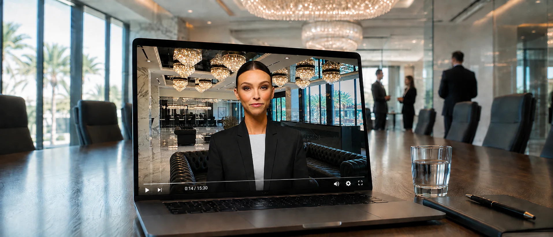
Create an educational video to help clients better understand the personal injury process, manage expectations, and clarify common misconceptions about medical treatment and settlements.
Complex legal and medical concepts needed to be communicated clearly without creating confusion, unrealistic expectations, or overwhelming clients with technical information.
We produced the video entirely with AI, using an AI presenter and clear visual storytelling to turn complex information into a structured, accessible, and engaging educational experience.

Develop a modern healthcare identity that communicated expertise, trust, and the high standard of care provided by Las Vegas Sports + Spine.
The brand needed to feel highly professional without becoming overly clinical or visually distant.
We combined clean typography, lighter blue tones, and a modern visual system to create an identity that feels approachable, credible, and premium.

Use Top of Funnel content to expand reach, humanize the brands, and create an initial connection between their teams and new audiences.
Trending content can increase visibility, but if a trend has no connection to the business, it can generate views without strengthening the brand or attracting a relevant audience.
We selectively adapted trends that naturally matched each team's personality and workplace culture, using them as awareness content to introduce the people behind the brands, increase engagement, and build familiarity with potential patients.

Grow The People’s Farm’s social media presence and turn the account into a stronger reflection of the brand, its products, and the value of microgreens.
The account started small and lacked clear direction. Because microgreens are a very specific niche, it was also challenging to identify the right content formats and attract the right audience.
We developed a clearer content strategy and tested formats that made the brand more engaging, educational, and visually appealing. By finding what resonated most with the audience, we helped the account grow significantly and build a much stronger presence online.

Transform Trattoria Italia’s inconsistent Instagram presence into a recognizable brand that communicated its authentic Italian experience and attracted more local customers.
The account had little visual consistency, with posts following different styles and no clear brand identity, making the profile feel disconnected and less recognizable.
We first established a consistent visual identity across the profile, optimizing the bio, profile image, highlights, and content direction. We then created content centered around authenticity, family tradition, food quality, and social proof, helping grow the account from around 1K to nearly 6K followers.

Build Symphony Mind’s Instagram presence from the ground up and create a profile that reflected the quality and credibility of their mental health services.
The account started completely from zero - no posts, no followers, and no established social media presence.
We developed the content strategy, visual direction, and growth-focused formats from scratch, building a strong digital presence and surpassing 10K followers within the first five months.

Elevate Greens Culinary Group’s Instagram and attract a qualified audience with the potential to become leads and customers for its luxury catering and private dining services.
Luxury catering is a highly specific niche, making it difficult to reach the right audience, generate qualified interest, and identify content formats that consistently performed.
Through continuous testing and refinement, we developed a stronger visual presence and content strategy that more than doubled the account's following while attracting qualified leads, potential customers, and supporting revenue growth.

Create Top of Funnel Reel formats designed to increase brand awareness, reach new audiences, and make Greens Culinary Group more relevant and recognizable within the luxury catering space.
Traditional food content alone wasn't enough to consistently capture attention or introduce the brand effectively to new, qualified audiences.
We developed repeatable formats such as Cooking with Chef Green and event-focused Reels with strong opening hooks, creating discovery-driven content that generated higher reach, saves, shares, and qualified interest in the brand.

Develop a professional visual identity that positioned Concept Auto Body as a modern and trustworthy automotive repair brand.
The identity needed to communicate precision and technical expertise while remaining distinctive in a competitive automotive market.
We created a cohesive system of colors, typography, graphic elements, and branded materials designed to feel technical, modern, and premium.

Create an elevated brand identity that reflected the quality, credibility, and personalized care provided by Hawthorne Surgery Center while still feeling approachable to patients.
The brand needed to communicate a refined, premium standard of medical care without appearing inaccessible, intimidating, or unnecessarily expensive.
We developed a sophisticated but approachable visual system using deep blues, teal accents, clean typography, and cohesive brand elements to establish credibility, quality, and trust without creating distance from the patient.

Create a website that communicated professional mental health care while making visitors feel welcomed, understood, and supported.
Mental health websites can easily feel overly clinical, while Symphony Mind needed to balance medical credibility with warmth and accessibility.
We combined a calming visual direction, approachable messaging, intuitive navigation, and responsive design to create an experience centered around trust and human connection.

Create a distinctive, elevated identity for Riverside Outpatient Surgery Institute that reflected the quality of its medical services.
The brand needed to stand apart from traditional healthcare identities while maintaining the trust and authority expected from a surgical institute.
We built a premium identity around black, white, and bold red accents, combining sophisticated typography with a strong and recognizable visual system.

Translate ROSI’s new identity into a website that clearly presented its physicians, services, and level of care.
A large amount of medical information needed to remain easy to navigate without sacrificing the brand's premium positioning.
We created a structured, responsive experience with clear service pathways, strong visual hierarchy, and consistent branding throughout every page.

Create a personal injury healthcare website that felt more human, inclusive, and community-focused than traditional industry websites.
Most personal injury healthcare brands follow similar serious and clinical visual patterns, while Private Practice wanted to communicate highly personalized care.
We created a more approachable digital experience centered around individuality, community, and the idea that every patient deserves a care plan built around their specific needs.

Create a modern, forward-looking website that clearly explained RadHawk Reads’ specialized diagnostic reporting services.
The service is highly technical, so the website needed to communicate complex information without overwhelming visitors.
We combined a futuristic visual direction with structured content, intuitive navigation, and clear service explanations to make the brand both credible and easy to understand.

Expand Trattoria Italia’s organic content with Reels designed to generate awareness, engagement, and restaurant discovery.
The content needed to compete in Las Vegas' crowded restaurant market while still feeling authentic to the Trattoria Italia brand.
We developed strong hooks and highly shareable concepts around authentic Italian food and the restaurant experience, with individual Reels reaching more than 100K views.

Create a one-page menu that made Olé Churros’ full product offering easy to understand while making each item feel immediately appetizing and worth ordering.
Multiple categories, products, images, and prices had to fit into a single page without becoming overwhelming. The visuals also needed to remain faithful to the actual products so customers knew what to expect when ordering.
We created a clear visual hierarchy using the brand's existing colors, organized categories, prominent pricing, and high-quality product imagery that stayed true to the real items while presenting them in the most appealing way possible.