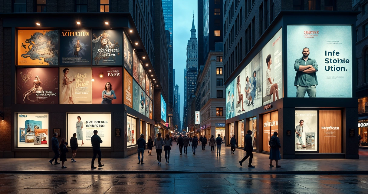
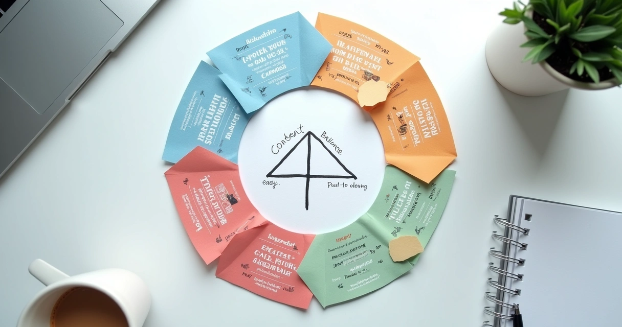
Looking like a big brand is not always about how much money I spend. In my experience, it is more about the intention behind each choice and the way I show up again and again. A small business can look polished, steady, and trustworthy when its design and content feel thought out. Customers notice that fast, often before they ever send a message or walk through the door.
People judge brand quality from small details long before they judge the product itself.
I have seen this happen many times. A business may offer great service, but if its logo is blurry, its colors change every week, and its captions sound like they were written by three different people, trust drops. Not because the business is bad, but because the signals are mixed. Clear branding sends a simple message. This business cares.
Start with a simple visual system
If I had to build a brand image on a tight budget, I would begin with a few visual rules and stick to them. You do not need a huge brand book. You need a usable system.
That system should include:
- A clear logo that works in color and black and white
- Two or three brand colors used in every channel
- One font for headlines and one for body text
- A repeatable style for photos, graphics, and posts
A consistent visual system makes a small business feel larger because it removes randomness.
I think many owners waste money by redesigning things over and over. They try one look for Instagram, another for flyers, and a third for their website. That breaks the brand. It also makes the business look unsure of itself.
A better move is to choose a clean logo, save the exact color codes, and apply them everywhere. Your business card, website banner, menu, social posts, and packaging should feel related. That is what larger brands do well. They repeat on purpose.
Consistency builds trust.
Make your content sound like one person
Visual identity gets attention, but tone builds familiarity. I always notice when a business writes in one style on its website and a very different one on social media. It feels disconnected.
Pick a tone that matches your audience and keep it steady. If your brand is direct and helpful, let that show in captions, emails, web copy, and replies. If it is warm and polished, keep that same voice in every customer touchpoint.
Here is a simple way I would define tone:
- Choose three words that describe how the brand should sound
- Write short examples of captions or replies in that tone
- Keep a list of phrases you often use
- Avoid switching style based on mood
This sounds small, but it changes how a business is perceived. A clear voice helps people feel they know who they are dealing with. That lowers doubt. Agencies like Strattz often help businesses shape this kind of consistency across content, which saves time and avoids expensive trial and error.
 Use fewer assets, but make them better
 Use fewer assets, but make them better
One mistake I see a lot is trying to create too much. Too many post styles. Too many taglines. Too many offers on one page. Big brands often look strong because they edit hard. They keep what works and remove the rest.
Instead of making twenty average graphics, make five strong ones that you can reuse. Instead of filling your homepage with every detail, lead with one message, one image style, and one clear next step.
A brand looks more expensive when it is focused, not crowded.
If your budget is small, put your energy into these assets first:
- A homepage with clean copy and strong contact info
- A profile photo or logo image that is sharp everywhere
- A set of social media templates
- A short brand bio for all platforms
- A few high-quality photos or videos of your business
I would rather have a simple site with clear writing than a flashy one that feels unfinished. The same goes for social media. If your feed uses repeating templates, balanced colors, and readable text, people assume the business is organized behind the scenes too.
Invest in photos and video where it counts
Nothing makes a business feel smaller faster than poor visuals. Dark photos, stretched logos, and shaky video can make even a good company look unreliable. I am not saying every business needs a full studio setup. I am saying the main images people see should look clean and current.
That means your storefront, team, product, workspace, or service process should be shown with care. If you can afford a half-day photo session, that can give you months of content. If not, create a simple shot list, use natural light, and keep backgrounds clean.
Strattz works with services like photography, video editing, motion graphics, and social media because these pieces shape first impressions so strongly. A well-edited short video can make a local business feel far more established than a long text post ever could.
Clean up your website and social presence
 Clean up your website and social presence
I have left websites in seconds because they felt neglected. Broken spacing, old offers, mixed colors, no clear service list. That hurts trust. A big-brand look starts with clean basics.
Check these areas first:
- Your homepage headline should say what you do in plain words
- Your contact info should be easy to find
- Your social bios should match your website message
- Your profile images should be current and sharp
- Your recent posts should reflect your brand colors and tone
If you want ideas on how content can support that image, I suggest reading pieces like this practical article on brand content, this example of digital positioning, and this guide on stronger online presentation. I also like reviewing a company’s full content hub and using a focused topic search page to find ideas worth applying.
Choose a creative partner instead of doing everything alone
There is a point where doing it all yourself starts to cost more. I have seen owners spend months changing fonts, rewriting captions, and rebuilding websites when a skilled team could have solved the issue much faster. The right creative partner helps you make better choices early, so you avoid waste.
This does not mean you need a giant monthly budget. It means getting help where it matters most. Maybe that is branding. Maybe it is web design. Maybe it is social content or paid media. The goal is to create a business image that feels steady and real.
For local businesses that want that polished feel without overspending, working with a team like Strattz can simplify the process. When one partner can support branding, design, content, websites, and media, the brand tends to stay more unified.
Conclusion
Looking like a big brand on a budget comes down to care, not excess. I believe customers can feel when a business has paid attention to the details. A clear logo, steady colors, matching fonts, better photos, and one consistent voice all send a message of quality before the first conversation starts. If you want your business to look more credible, more polished, and more ready for growth, get to know Strattz and see how the right creative support can help you build that image with less waste and better direction.
Frequently asked questions
How can I make my brand look bigger?
I would start by making your brand look consistent everywhere. Use the same logo, colors, fonts, tone of voice, and image style across your website, social media, and printed materials. Keep your message clear and your design simple. A business looks bigger when it looks organized.
What are affordable branding tools for startups?
In my view, affordable branding tools include simple logo files, a short brand guide, reusable social media templates, website builders, basic photo editing apps, and scheduling tools for content. The best low-cost tools are the ones that help you keep the same look and voice every week.
How much does professional branding cost?
Professional branding can vary a lot based on scope. A small project may cover a logo, colors, fonts, and templates for a modest budget, while a full brand package with website, photography, and content planning costs more. I think the smarter question is what you need first, so you can spend in stages.
Is it worth it to hire a designer?
Yes, I think it often is, especially if your current branding feels mixed or outdated. A good designer can save you from repeating mistakes and help your business look more credible faster. If budget is tight, start with a small project that fixes the most visible problems first.
What are the best free branding resources?
The best free resources are usually simple ones: font libraries, color palette tools, mockup templates, content planning sheets, and brand checklists. I also find free educational articles helpful when they show clear examples. Use free resources to create structure, then improve the pieces that customers see most.